How small design decisions can make a big impact
Sustainable Design and Typesetting
Paper is the biggest contributor to a book’s carbon footprint. Book designers are the leading experts during the book production process, that will be responsible for many small decisions that will ultimately change how long the book is and therefore how much paper is used. That means sustainable design decisions are the responsibility of the book designer and many of those decisions come down to the typesetting phase of the project.
What is typesetting?
Typesetting is the process of composing text on the page. The term comes from early printing methods where cast metal characters or glyphs were arranged physically by hand to compose each page of a book. Now this is primarily done by computer software. The process of typesetting involves a large array of design decisions such as margin size, type size, leading (or the space between lines of text), word spacing, and the use of small caps versus all caps. There are also rules that book designers put in place such as whether or not one line of text can be left at the bottom or top of a page, or if two or more lines must always be together. All these seemingly small elements can work together to have a large impact on sustainable design and how long a book ends up being.
What is sustainable typesetting?
Sustainable typesetting is a fairly new term in the world of sustainable design. 2k Denmark is a pioneer in the space and has created proprietary fonts that boast more economical spacing because the letterforms are more compact and can be produced at a smaller scale without losing legibility. The company can be hired to typeset books, boasting a 20% reduction in size that has a trickle effect to a 20% reduction in the book’s carbon footprint because of the reduction in paper usage as well as the weight of the book and space it takes up when shipping.
Sustainable Typeface Comparisons
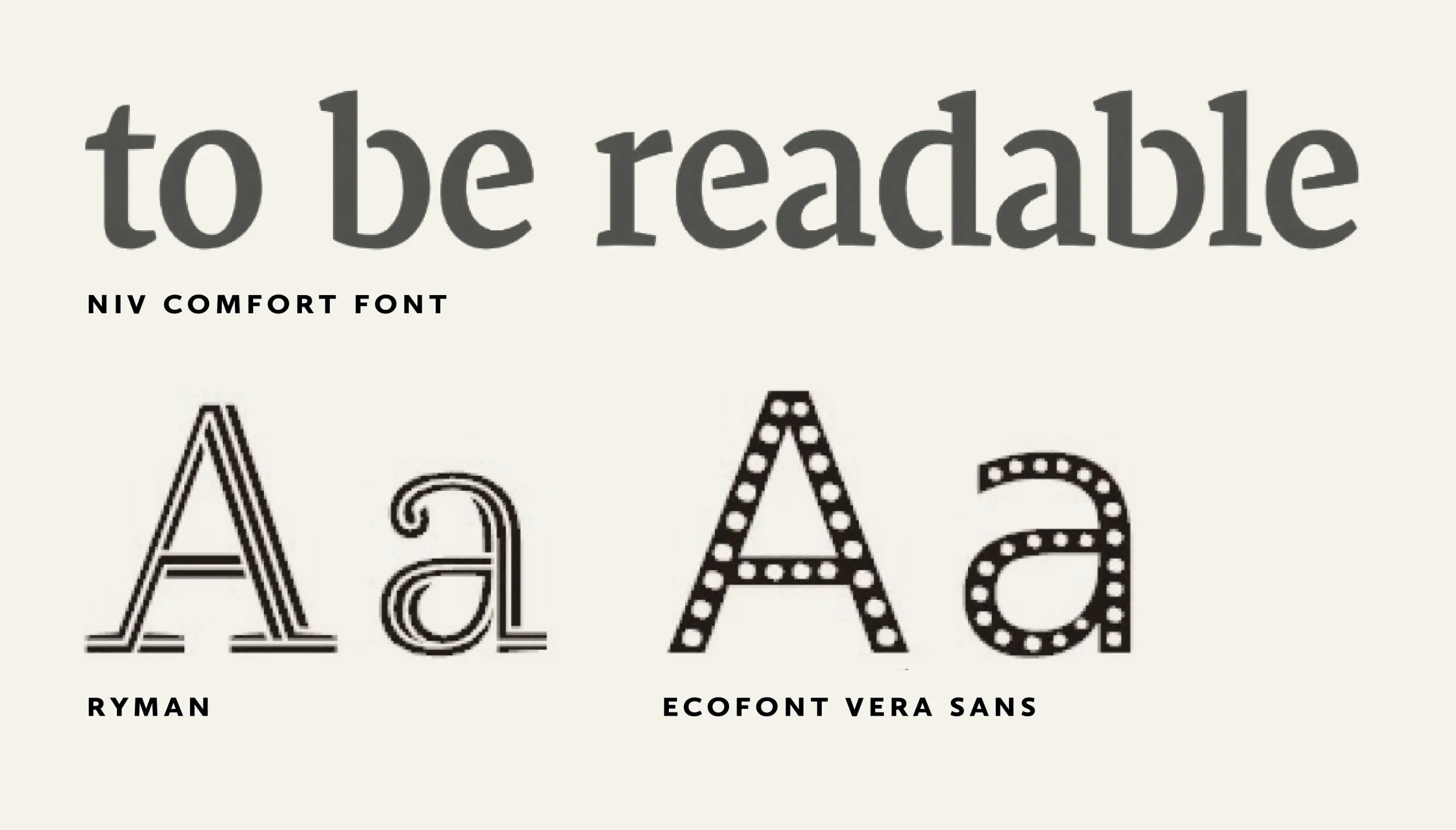
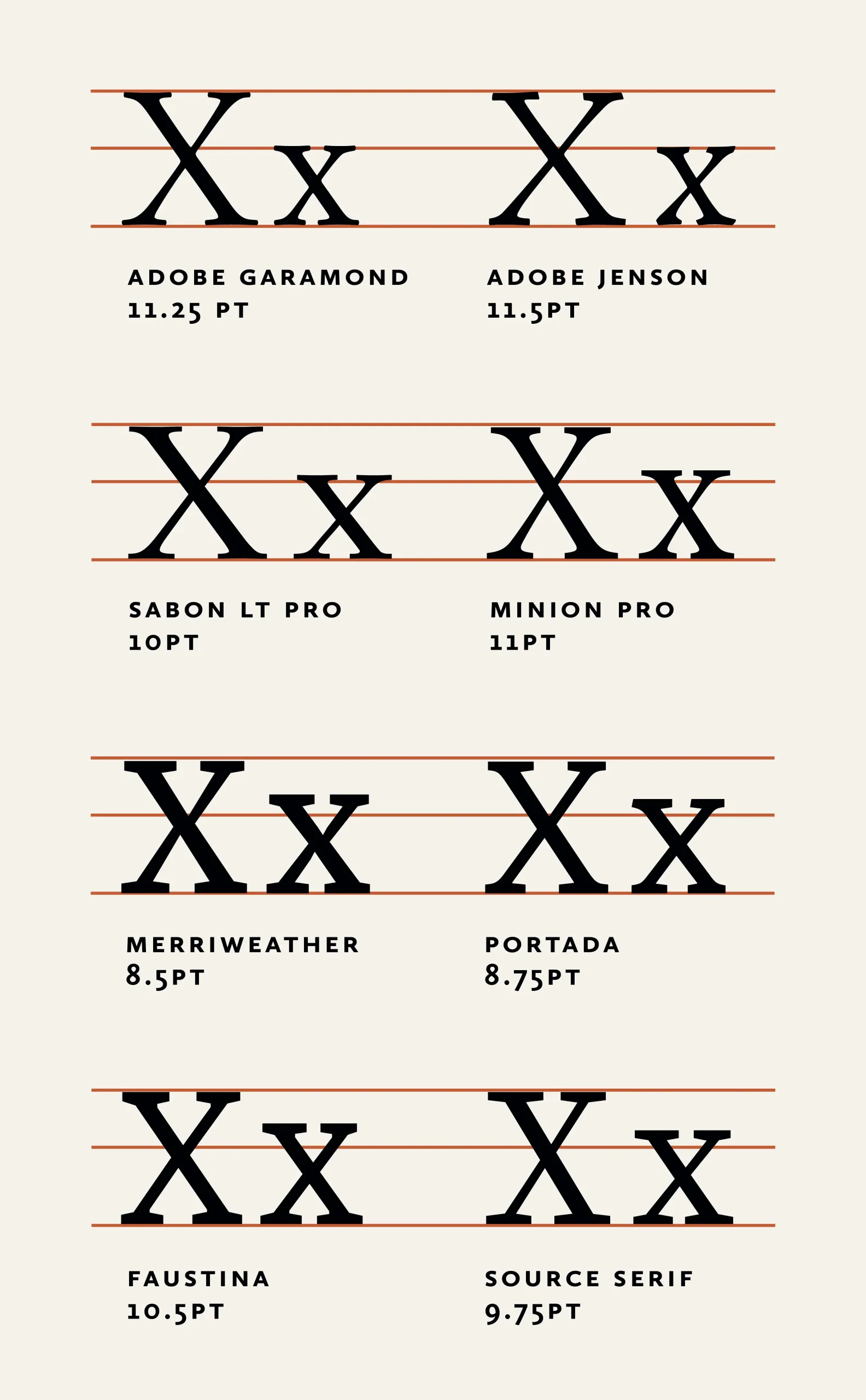
Here’s a look at some sustainable font choices.
- Garamond is considered to be a a top sustainable font because of it’s readability though this is contested by some
- Other sustainable fonts such as Ryman Eco and Ecofont Vera Sans have been created to reduce the amount of ink uses. You can see that these fonts have whitespace in their letterforms. They are display typefaces which are not suitable for long format text.
- The fonts Merriweather, Portada, and Faustina were chosen for their proximity to the proprietary “NIV Comfort Font” used by the company 2K Denmark for economical bible production. Since the bible is such a long text and it has one of the highest print volumes out of any other book in the world, it’s a good place to look for developments in economical typesetting and sustainable design.
- The fonts listed in the graphic are in equivalent sizes, meaning they output approximately the same number of pages.
- The size listed is a suggested minimum. Before going smaller, assess the number of characters per line (ideally 50-75) for readability.
- The typefaces with larger x-heights and thicker more sturdy appearance will be more suitable to scale down further to save additional pages. The x-height of the font is how tall the lowercase x is. You can see how some fonts, even when at equivalent sizes have a higher x-height. This makes them more readable at smaller scales. If a font has an x-height that is far too high or too low, it will be hard to read at small sizes.
- Note that the personality of the thicker fonts may not be suitable for all projects.
The Sustainable Design Experiment
Sustainable design is very important to my design practice. I am also a big believer in open source knowledge so I wanted to take the principles of sustainable design and typesetting and apply the tools that every book designer has at their disposal. Thus creating a set of tips for the book design community to use in their own typesetting projects. I conducted an experiment to reduce the page count on a novel without sacrificing the quality of the design. Here’s how that process went.
The design elements to consider
- Type choice (x-height, thickness, width, overall legibility)
- Type size
- Leading
- Margins
- Blank pages
- Typesetting conventions (starting elements on rectos)
- Print signatures
- Ink usage
The parameters of my test
- The book is 86,269 words
- Text only manuscript
- Standard size of 6″ × 9″
- Design details:
- Part names are set on their own pages
- Chapter opening page text starts partway down the page
- There are dingbat editorial breaks
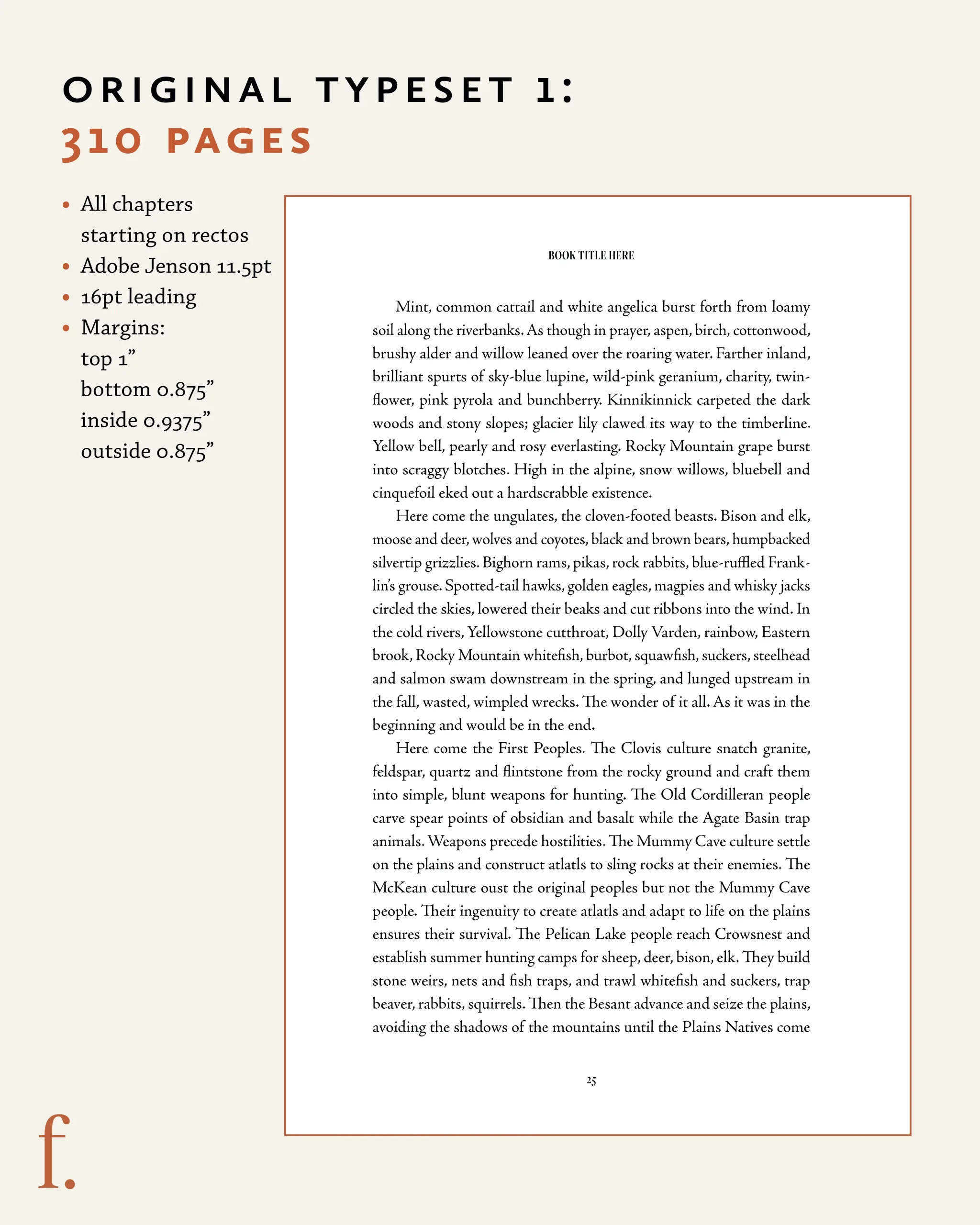
The original typeset 1: 310 pages
- All chapters starting on rectos
- Adobe Jenson 11.5pt
- 16pt leading
- Margins: top: 1″ bottom 0.875″ inside: 0.9375″ outside: 0.875″
<p><p><p><p><p><p><p>&amp;amp;amp;amp;amp;amp;amp;amp;amp;amp;amp;amp;amp;amp;amp;amp;amp;amp;amp;lt;p><p><p><p><p>
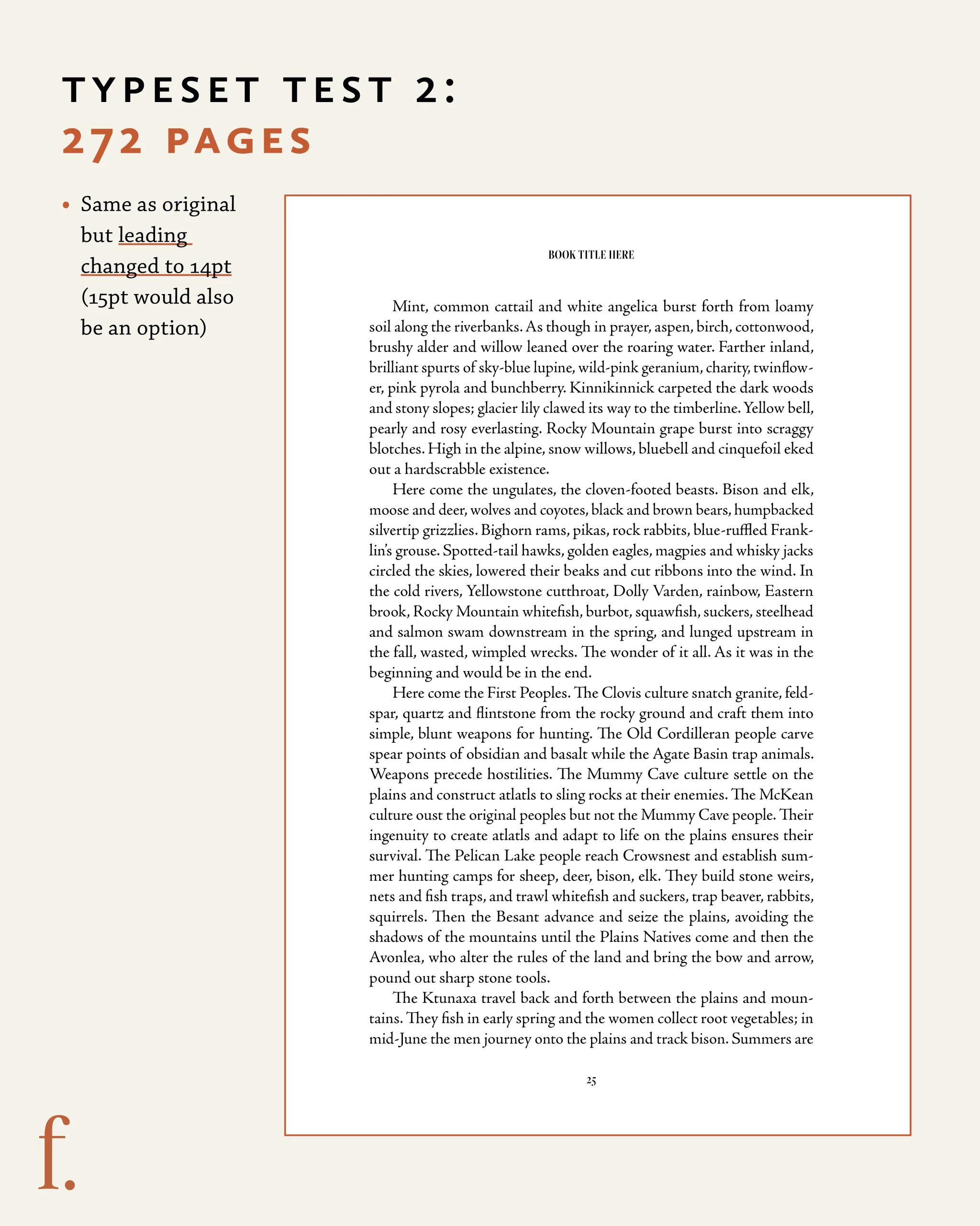
Typeset test 2: 272 pages
- Same as original but leading changed to 14pt (15pt would also be an option)
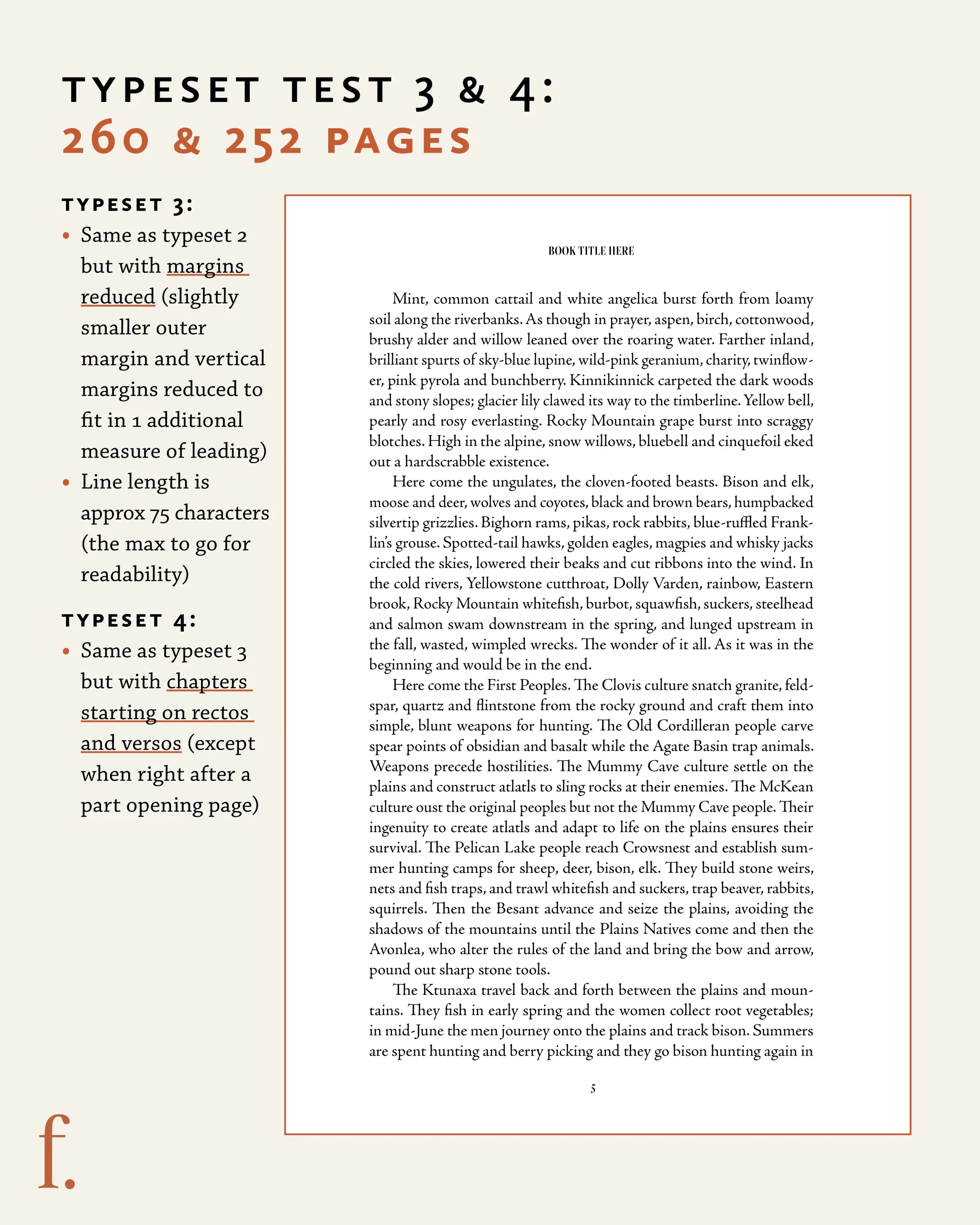
Typeset test 3 & 4: 260 & 256 pages
- Same as typeset 2 but with margins reduced (slightly smaller outer margin and
vertical margins reduced to fit in 1 additional measure of leading) - Line length is approximately 75 characters (the max to go for readability)
- Test #4 goes even further and starts chapters on rectos (right pages) and versos (left pages) except when right after
a part opening page thus reducing even more blank verso pages.
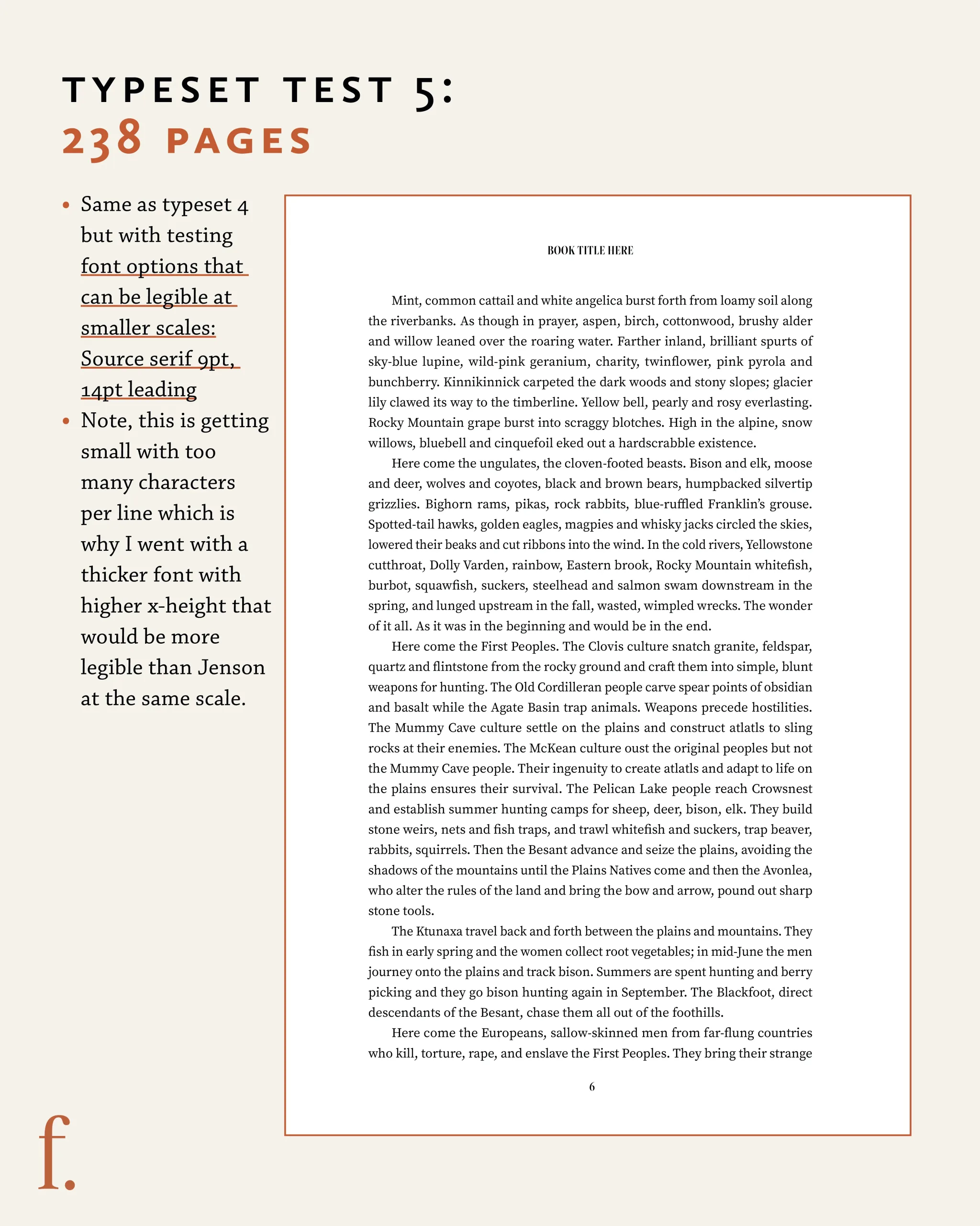
Typeset test 5: 238 pages
- Same as typeset 4 but with testing a different font option that can be legible at smaller scales
- Source serif 9pt
- 14pt leading
- Note, this is getting small with too many characters per line which is why I went with a thicker font with higher x-height that would be more legible than Jenson at the same scale.
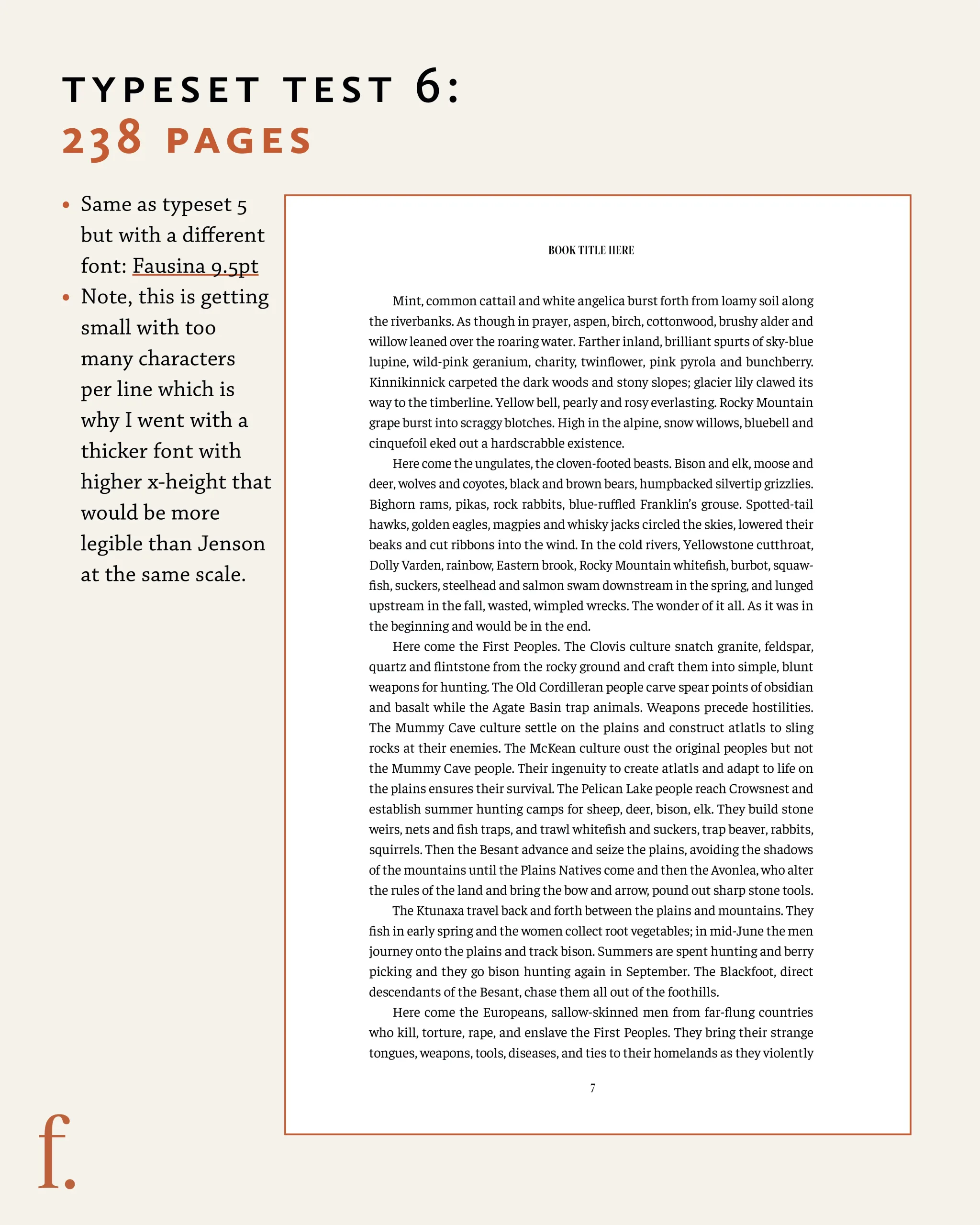
Typeset test 6: 238 pages
- Same as typeset 4 but with testing a different font option that can be legible at smaller scales
- Faustina 9.5pt font
- 14pt leading
- Note, this is getting small with too many characters per line which is why I went with a thicker font with higher x-height that would be more legible than Jenson at the same scale.
The amazing results?
- We could save up to 72 pages per book
by tweaking our design choices. - Across a print run of 3000 copies, that would save 216,000 pages!
- Less pages also means lighter books that have a smaller shipping footprint
How can you bring sustainable design knowledge to your books?
Tips
- Folio (page number) and running header or footer placement can have an impact on how many lines fit on a page. Running them together at the top of bottom of the page will save space rather than the page number at the bottom and the book title and author name at the top.
- If you are reducing the margins and font size, be sure to check the 75 character per line maximum for readability
- Always test print your font size and leading to ensure legibility, the goal is not to sacrifice readability. A book that is hard to read and ultimately ends up in a landfill is not the more sustainable choice.
- The amount of white space around chapter openings can impact page count.
- Being sure to remove orphan and widow words can save a few pages across a large book.
- Justification adjustments did not have significant impact on page count (though they should be optimized for better reading experience).
- InDesign keep options can be changed depending on press house styles (can 1 line of a paragraph be left at the top or bottom of a page to reduce blank/unused lines at the bottom of pages)
Questions to ask to reduce page count
If you’re an author or member of a publishing team, here are some questions you can ask your book designer or production department to see if reducing the page count is possible.
- Can we start chapters on both recto (right) and verso (left) pages? This goes against convention but can save many blank pages.
- Do we need a half title page? If there’s an advance praise page, can it replace the half title page? The half title page is a single page before the full title page that includes the title of the book. It is blank on the back. I personally feel that this is a waste of 2 pages.
- What is the most economical page count based on our printers recommendations?
- What shifts can we make to remove extra blanks at the back of the book to get down to the previous signature? A signature is the larger sheet of paper that you’re book’s pages are printed on. Signatures can be in various page counts (commonly 24, 16, or 8 pages) and ensuring your book’s page counts is divisible by the signature size will result in both cost savings and reductions in paper waste.
- Can we reduce the margins without the design looking too condensed?
Note that these are not hard and fast rules, but suggestions for everyone to explore. The goal is to be more sustainable without sacrificing design or readability.
Now go forth and save trees!



Leave A Comment